Sponsored
Techradar |
- Blackphone sheds light on world's first privacy-focused app store
- How to secure business mobile devices: a safety checklist
- The number of households with a TV falls for first time ever in UK
- New Optus Cable bundle gives you all of the data, entertainment and phone calls for $90
- LG's 2015 plans may include 'G Pen' and a single smartphone
- Ford Mustang to be watered down for Australia
- Updated: Nexus 6 release date: where can I get it?
- Blip: 20th anniversary PS4 sells for insane sums on eBay
- DirecTV launches 4K UHD satellite into space
- Microsoft just made Bing search even more like Google
- Review: Updated: Samsung Galaxy Tab S
- Vimeo now supports 4K videos, but not how you might think
- Review: PCKeeper Live
- Facebook Graph Search can now help find posts you've forgotten
- Review: Updated: OS X 10.10 Yosemite
- Updated: iPad Pro release date, news and rumors
- Samsung Gear VR now available in US
- Exclusive: EE to trial hyper-speedy, next-gen 4G early next year
- Industry Voice: How to survive the holidays with your office productivity intact
- Create your own app: the rise of App Builders
| Blackphone sheds light on world's first privacy-focused app store Posted: 09 Dec 2014 01:09 AM PST  Blackphone is giving privacy-focused apps their first home thanks to the January launch of its own app store for the company's off-the-record smartphone. It's officially known as the Blackphone app store, and while the name may be unoriginal, the concept is unique: this is the first in the world to solely focus on privacy applications. Mail clients, messaging services and other applications are said to be on the way, all with the extra security layers via Blackphone's trusted VPN. Blackphone CEO Toby Weir-Jones told TechRadar that his company is going to curate these apps. Backdoors that sometimes exist in Android apps aren't going to be a part of this store. PrivatOS 1.1 updateThe Blackphone app store is only half of the company's announcement today. It's also adding a new feature called "Silent Spaces" within PrivatOS version 1.1. These are self-contained spaces for apps, data and accounts, all on one device. Blackphone is determined to rid privacy-concerned users of the need to carry two smartphones. It sounds a whole lot easier than juggling a pair of phones, too. Switching between two Silent Space happens in the pull-down notification menu of the Android KitKat-based PrivatOS. Weir-Jones describes the transition between Silent Spaces as instantaneous and completely separate. Games can live on one space while while sensitive work files are house in another. Sandboxing Samsung KnoxWhat's unique is that PrivatOS 1.1's Silent Spaces feature makes both environments secure. That's unlike the app sandboxing method of something like Samsung Knox. Blackphone doesn't just separate sensitive data from normal everyday apps, leaving you data vulnerable without you even knowing it. It promises a complete privacy solution. Of course, this means that, unlike Samsung's devices, the Google Play Store isn't available to this almost spy-proof smartphone that features a forked Android operating system. Instead, Blackphone's privacy-focused app store is to become the star of this locked-down phone in the new year with its trusty sidekick, sideloading apps from places like the Amazon app store. We'll have more on Blackphone's future care of our discussion with CEO Toby Weir-Jones. Stay tuned for tomorrow's update. |
| How to secure business mobile devices: a safety checklist Posted: 09 Dec 2014 12:55 AM PST 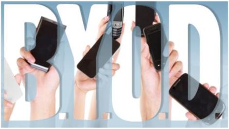 According to the Cyberthreat report from the CyberEdge Group, mobile devices (smartphones and tablets) are perceived as IT security's 'weakest link,' followed by laptops and social media applications, with one in four security professionals doubting whether their organisation has invested adequately in cyberthreat defences. The small business sector is particularly vulnerable with the Federation of Small Businesses (FSB) stating that the average SMB loses £4,000 (around $6,250, AU$7,500) a year from cybercrime attacks. The move to adopt more mobile and flexible working practices across the SMB sector has increased these risks. The wireless access of data across your business is a weakness, but one that you are not powerless to improve. Follow this 10-point checklist to ensure your wireless data services are safe and secure: 1. Develop a security policySMBs need to develop a comprehensive security policy that everyone across the company adheres to. Think about the data that your business contains. How is this accessed? Which mobile devices are in use by your employees? Answering these questions is the foundation onto which a robust mobile security policy can be built. 2. What kind of data needs to be secured?All data is not equal when it comes to mobile security. Assess the different types of data that mobile devices need to access, store and transport. Some data will be more sensitive than others. Perform a thorough data audit to place your data into security groups that can then have security protocols applied to them. 3. Do you allow BYOD?The rise of BYOD (Bring Your Own Device) across the SMB community in particular opens your business to a potential raft of security issues. Think about how your business' security policy has to be designed to take into consideration the increasing use of BYOD across your organisation. Should your business only issue its own devices to employees? 4. Use data encryptionWhether or not encryption should be used when data is stored or transmitted between mobile devices needs to be carefully assessed. Encryption needs to be seamless if users are to adopt it. There are various encryption systems that can be used. Your threat assessment will reveal the risks your business data faces, which will then give you a guide for which encryption system to use. 5. Passwords for mobile devicesThe password is at the heart of secure systems, yet is often the most overlooked element. Secure passwords should be used across all mobile devices to ensure their stored and transmitted data is secure. Read the TechRadar Pro guide to better password security. 6. Remote workingAs mobile devices are used on the move by their nature, securing them is vital. Using VPNs (Virtual Private Networks) is fast to setup, as the market for these services has matured. Your business security policy should include VPNs that must be running at all times across every mobile device that is sending or receiving sensitive information. 7. Lost and stolenSMBs must not become too focused on the protection of data across the mobile devices in use across their enterprises. Of course, if these devices themselves are lost or stolen, their data can also be compromised. Ensure that your business has considered how to physically secure its mobile devices. 8. Keep up-to-dateData security on mobile devices is not a setup and forget exercise, as mobile devices change so often. It is vital that your mobile data security policy includes regular reviews that assess if your current security regime meets all the current threats that the data on these devices faces. Sophos advises: "The mobile security market is moving very quickly. Mobile devices are being updated on practically a quarter-to-quarter basis versus the conventional slow-moving PC. IT teams should implement a shorter term strategy for mobile devices and then iterate it, rather than attempting to plan for three years in one go." 9. Managing devicesThe use of mobile devices for work and personal use has a profound impact on the security of these devices. To help businesses manage this, Mobile Application Management (MAM) and Mobile Device Management (MDM) have developed. Dell advises: "A wide range of MDM vendors offer tools for tracking and securing mobile devices, and many offer features like file synchronisation, app sandboxing and secure network tunnels for corporate data. The Gartner Magic Quadrant provides a good survey of the current major players. Over time, we expect to see more and more MDM features included in the major endpoint management solutions from Dell, Microsoft, Symantec and others." 10. Protect the cloudUsing mobile devices across your business will inevitably mean accessing cloud-based services. Your enterprise's security policy should ensure that cloud services are bought from reputable vendors and are designed for business use and not consumers, as it is a false economy to try and use these low cost services. Sophos concludes: "We need a new attitude toward information security: embrace or die. This change of attitude also impacts the future of mobile security and applications. Information security presents us with the interesting challenge of managing risk of allowing devices that in some cases are less secure and more expensive to manage. "Mobile security in general will continue to be a hot topic. The continuing adoption of emerging apps for personal and business communication widens the attack surface, particularly for social engineering scams and data exfiltration attempts. Your address book and your social connections graph is a treasure for cyber-crooks of all sorts, so be mindful of whom you entrust to access it and why. Mobile and web applications control for business users will help mitigate this risk." |
| The number of households with a TV falls for first time ever in UK Posted: 09 Dec 2014 12:40 AM PST  The UK has seen the number of households with a television fall for the first time ever, as we increasingly turn to alternative devices. Figures released by Ofcom - the media watchdog - show a fall from 26.33 million households with a TV in 2012 to 26.02 at the end of 2013. The change is being blamed on our move to alternative devices, using tablets and phones along with the plethora of streaming and catchup services rather than a traditional television. Apparently there are now a million more homes with broadband than with a television, pointing to a big shift in behaviour. CrucialEd Richards, Ofcom Chief Executive, said: "Digital infrastructure is crucial to the UK's future. As a country we are continuing to make real progress, particularly in the roll out and take-up of superfast broadband and 4G mobile services. But there is more to be done. "We need to continue asking whether collectively we are doing enough to build the infrastructure of the future, and to maintain the competition that benefits consumers and businesses." Richards points to changing consumer habits as central to the need to get decent connectivity into rural areas - given its importance in daily lives. "The way consumers interact with their TV, phone and broadband is changing as fast as technology is evolving," he said "Our challenge is to keep supporting competition and innovation, while also helping to improve coverage across the country - particularly in hard-to-reach areas where mobile and home internet services need to improve." |
| New Optus Cable bundle gives you all of the data, entertainment and phone calls for $90 Posted: 08 Dec 2014 09:42 PM PST  Optus has announced a new Ultimate Cable Bundle that gives its customers unlimited cable broadband data, local calls and access to its Optus Fetch TV entertainment package for $90 a month. The Fetch Entertainment pack features access to over 30 channels, including ESPN, the Disney Channel and a range of movies per month. The deal also includes an international calling pack, with unlimited calls to landlines in Austria, Canada, Chile, China, Croatia, France, Germany, Greece, Hong Kong, Hungary, India, Ireland, Italy, Japan, Malaysia, Netherlands, New Zealand, Poland, Singapore, South Korea, Taiwan, Thailand, Turkey, United Kingdom and the United States of America. If that laundry list of countries isn't long enough, unlimited calls can also be made to mobile phones in Canada, China, Hong Kong, India, Singapore, Thailand, and the United States of America. I feel the need, the need for speed!Optus' standard HFC cable network can deliver download speeds of up to 30 Mbps, or up to 100 Mbps for those willing to spend an extra $20 a month for the added speed pack. The entry-level bundle makes Optus the first Australian telco to offer unlimited high-speed internet, calls and entertainment for under $100. There is a catch though – the Ultimate Cable Bundle is only available to customers on Optus' Hybrid Fibre-Coaxial (HFC) cable network, and that's pretty much limited to major metro areas. You can check the Optus HFC coverage map to see if you can get connected to the cable network. If not, there's always the promise of the NBN... |
| LG's 2015 plans may include 'G Pen' and a single smartphone Posted: 08 Dec 2014 05:57 PM PST  Companies ranging from Samsung to Sony are said to be cutting down the number of smartphones they'll produce in 2015, and now we can add LG to that list. In fact, the Korean company will only launch a single flagship smartphone in 2015, says Korean site Heraldcorp. That may very well mean no LG G Pro 2 sequel, with efforts focused on the LG G4 instead. No paltry penIn addition a trademark spotted by Phandroid covers a "G Pen" that could go far beyond what the LG G3 Stylus's paltry pen offered, reports Phandroid. The descriptions in the patent filing are vague, but the G Pen could be a standalone stylus for LG devices, a companion gadget for the LG G4, or something else entirely. Now let's just hope the alleged Snapdragon 810 defects really don't cause any delays next year, just like Qualcomm says they won't. |
| Ford Mustang to be watered down for Australia Posted: 08 Dec 2014 03:40 PM PST  The long wait for the Mustang to thunder across this wide brown land is almost over. Unfortunately, it looks like it won't be doing quite as much thundering as we'd hoped. A presentation at Ford's Broadmeadows head office has revealed that the Australian edition won't be quite as powerful as its US counterpart when it launches in the second half of 2015. The States' Mustang GT 5.0-litre V8 produces peak power of 324kW, but the Australian edition will only manage 303kW, despite featuring the same engine. Yay or neigh?It's not exactly a deal breaker – the Mustang will likely remain irresistible to those who've endured the long wait for the American muscle car's arrival on our shores – but we can't help feeling that reducing a Mustang's power goes against everything the pony badge stands for. Ford has also put a dampener on the Australian model's torque, with the local 'Stang offering 525Nm, compared to 542Nm in the US. We're still awaiting local pricing for Ford's show pony, though it's a safe bet the Australian version will be dearer than its more powerful American sibling.
|
| Updated: Nexus 6 release date: where can I get it? Posted: 08 Dec 2014 03:28 PM PST  Update 12/8/2014: US Cellular has announced the details of its Nexus 6 release date, and we've updated the information below yet again. Update 11/20/14: Sprint has permanently reduced the price of its Nexus 6 by a full $50, so we've updated the information below to reflect that. Update 11/14/14: Go check your order status if you bought the Nexus 6 through Google Play, because the phones are beginning to ship out to users, reports Android Police. Interestingly these orders are shipping straight from China to customers without stopping in the US first, but it's unclear whether that will affect shipping times. Update 11/11/14: Shortly after announcing it would sell the Nexus 6 on November 12, T-Mobile changed its plans - scroll down for the full scoop. Google and Motorola's Nexus 6 is the latest and greatest flagship smartphone to carry the esteemed Nexus branding, and as such it's in very high demand. Google itself began selling the Nexus 6 with Android 5.0 Lollipop long before any carriers got to offer it, but that's slowly changing. Announcements from US carriers are finally beginning to trickle in, and we'll collect them here as they do. So where can you get the Nexus 6? Keep reading to find out. Google PlayUnsurprisingly Google Play was the first source to offer the Nexus 6 for sale. It has been hard to snag one through Google's own storefront, but at this time the search giant has promised to release another shipment online every Wednesday, so at least there's some consistency. Google Play lists the Nexus 6 starting at $650 for the 32GB version, so if you want to get a financed version cheaper on-contract or spread out your payments over several months you're going to want to scroll down and check out what the carriers have to offer. AT&TAT&T was one of the first US carriers to announce its Nexus 6 release date, after Google itself. The blue carrier will begin offering the Google flagship for pre-order on Wednesday, November 12, online and in stores, though it's unclear when it's shipping out. The Nexus 6 on AT&T will cost $249.99 on a two-year contract, $682.99 with no contract or $22.77, $28.46 or $34.15 with AT&T Next 12-month, 18-month or 14-month plans, respectively. In addition opening a new AT&T Next line and buying a Nexus 6 can save you $50 on a Moto 360 smartwatch, Moto Hint Bluetooth earbud or Moto Sliver II6 headset, and new customers who switch from other carriers and buy a Nexus 6 will get a $150 bill credit too. SprintSprint was also quick to announce its plans for the Nexus 6, with the news that it will carry the handset online and in stores beginning Friday, November 14. The carrier focused on its Easy Pay plans for its initial announcement, sharing that it will sell the Nexus 6 for 24 monthly payments of $29, totaling $696, not including tax and wireless service. But then, in a surprise twist, Sprint permanently lowered its Nexus 6 price by $50. That means Easy Pay customers will shell out $27 per month instead of $29, contract customers will pay $249 with a two-year agreement, and those who'd rather just pay upfront will owe $648. T-MobileT-Mobile at first got in early to announce it would begin selling the Nexus 6 on November 12, but the "un-carrier" shortly later - the same day, in fact - changed its plan. "To give @TMobile customers the best experience possible, we're moving our #Nexus6 launch out one week to 11/19," the pink carrier said on Twitter. Other than that unfortunate delay it seems the same price of $27.08 per month over 24 months, totaling $649.92, still applies. US CellularUS Cellular began selling the Nexus 6 in various configurations beginning December 8. The fifth-biggest US carrier is selling the Nexus 6 in blue or white and at 32GB or 64GB starting at $200 with a two-year contract. Oddly US Cellular is the only carrier currently offering the Nexus 6 in both color options. VerizonTechRadar confirmed with Verizon that it will carry the Nexus 6, but the final US carrier hasn't yet announced its plans in detail. When it does, we'll update you right here - naturally! |
| Blip: 20th anniversary PS4 sells for insane sums on eBay Posted: 08 Dec 2014 03:02 PM PST  With the 20th anniversary of the PlayStation brand Sony revealed a special treat for diehard fans: a grey PS1-themed PlayStation 4 console sold in very limited quantities. How limited? Enough so that one just sold on eBay for over $20,000 (about £13K, AU$24K). Another auction ended at over $15,000 (about £10K, AU$18K). The 20th anniversary edition PS4 sold through Sony's website for just $500 (£400, about AU$600) officially, including the console and a matching controller and PlayStation Camera. Sony sold just 12,300 units of the special edition PS4 initially to match the date of the original PlayStation's launch on December 3 1994, and its official store says no more are coming, but you may as well keep checking back every day for the rest of your life - you never know. More blipsYou don't have to win a bidding war or spend your life savings to read more collector's edition TechRadar blips.
|
| DirecTV launches 4K UHD satellite into space Posted: 08 Dec 2014 02:46 PM PST  Commercial launch company Arianespace this morning launched into space a salvo of rockets that included satellites that will be used by the India Space Research Organization and - clearly more importantly - DirecTV. The satellite cable provider will use the 7-ton DirecTV-14 satellite to deploy 4K video content to subscribers in the US and Puerto Rico via an advanced beam network, Digital Trends reports. The satellite is reportedly settling into its final orbiting positions successfully, though it's not clear when exactly 4K DirecTV service will actually begin. DirecTV already offers some 4K content to Samsung 4K TV users with a limited video on demand service, but today's satellite launch is the company's biggest step yet toward providing content for a 4K future. DirecTV-14 is the company's seventh functioning satellite. |
| Microsoft just made Bing search even more like Google Posted: 08 Dec 2014 02:15 PM PST  Starting today Bing searches will look a little bit more like Google results thanks to a new feature called "Fact Answers." And "new" is applied liberally here, since Fact Answers are identical to information Google has offered for a long time. Basically when you search for businesses or addresses you can add certain terms, like "hours," "phone" or "directions," to your query, and the relevant info will appear on a card at the top of search results, Microsoft announced in a Bing blog post. Bing knows what day of the week it is and where you're located, and it does its best to provide relevant information. Bing Fact Answers are available across desktop and mobile, so users looking for a Google alternative on any platform should now have one fewer qualm about using Bing instead. |
| Review: Updated: Samsung Galaxy Tab S Posted: 08 Dec 2014 01:53 PM PST  Introduction and key featuresUpdate: Android 5.0 Lollipop has been making waves with the 'Material Design' UI overhaul. When will Lollipop make its way to the Samsung Galaxy Tab S? Find out here. If you're on the fence between the Apple iPad Air and the Samsung Galaxy Tab S, we've built an in depth feature comparing every little detail just for you. Check that out right here. The Galaxy Tab S 8.4 and 10.5 are Samsung's latest flagship devices, built to show off the very best of the company's hardware and software prowess. They're designed as upgrades to the Tab Pros we saw earlier this year, with some spec bumps, a slightly evolved look and, of course, different screen sizes, just in case you were foolishly expecting Samsung to follow any kind of pattern as far as display dimensions are concerned. Apart from the screen sizes there's very little difference between the Tab S models, so this review combines the two tablets into one. I'll talk primarily about the 8.4-inch model and include additional observations about the 10.5-inch version where necessary. It's a brutal battle down at the budget end of the tablet market — one that Apple refuses to get involved in — but here we're very much at the premium end of the scale. The Galaxy Tab S devices have been built to go toe-to-toe with Apple's slates, a brave and perhaps foolhardy undertaking.
First impressions are good, though: these devices feel like they're made by a company that has perfected its art. Both models have a 2560 x 1600 pixel WQXGA Super AMOLED screen, which works out at 287 pixels-per-inch on the larger model and 360ppi on the smaller one. The internals are identical, comprising 3GB of RAM, 16GB of storage, an 8MP rear camera and 2.1MP front-facing camera. The Samsung Exynos 5 Octa CPU inside these tablets combines 1.9 and 1.3GHz quad-core processors with the faster taking over from the slower when required at the expense of some battery life. Those are some eye-popping specs, and still better than the iPad Air 2 which now packs 2GB rather than 1, or that the 2013 Nexus 7 offers a resolution of just 323ppi on its 7-inch screen. There's much more to a device than raw specs of course, but on paper at least Samsung has produced a true champion.
The pricing of these slates matches Apple's iPad line - and even the new models. The Wi-Fi Tab S 8.4-inch will set you back £319 (US$399.99, AU$479.00) the same as the 16GB Wi-Fi iPad mini and the Wi-Fi Tab S 10.5-inch comes in at £399 (US$499.99, AU$599.00) the same as the 16GB Wi-Fi iPad Air. 3G/4G versions of the tablets that can access mobile networks with a SIM card are also on the way, as are 32GB models. Aside from the iPads and the Sony Xperia Tablet Z2,, the Galaxy Tab S doesn't have much competition. You could put it up against the likes of the Nexus 9 (though it's starting to show its age) but really with most other Android tablets going for less powerful innards and lower prices, Samsung has the premium end largely to itself. Has it produced an iPad rival that Android users can be proud of? Key featuresSamsung has never been one to shy away from packing in as many bells and whistles as it can, and the Tab S is no exception. Like the Galaxy S5, the tablet boasts a fingerprint scanner that you may or may not prefer to a PIN code. It recognised my print every time, but because you need to swipe the home button rather than just put your finger on it, the process can be fiddly - especially the larger tablet, which meant some precise holding to make the function work.
Multi-facetedThere's a multi window feature for multi-tasking which works as advertised, letting you chat while browsing the web or control your music while poring over Google Maps and so on. It's of more use on the larger tablet and at this stage multi-tasking on a tablet feels kind of superfluous — once you get a keyboard up on screen as well everything starts to get really cluttered.
Tablets are built for single-tasking and there doesn't seem to be any real need to try and turn them into fully fledged computers, but if you think you're going to find the feature useful then by all means power it up. The way that Samsung has implemented it works fairly well and managing open windows and apps is straightforward. However, only the main native apps and a few extras such as Facebook and Evernote support it, so you can't go multi-tasking crazy. Phone and tablet togetherAnother Samsung extra is SideSync, enabling you to link a phone with your tablet — you can then send and receive voice calls, transfer data, send texts and more. Unfortunately, it only works with a few Samsung phones (the S5, the S4 and the Galaxy Note 3) which limits its appeal. Like Multi Window, it feels like a niche feature created just to show off rather than to meet any particular need, but to some it will be a great innovation.
There are 30 different gifts bundled with the Tab S, covering subscriptions to sites like the New York Times and the Wall Street Journal to an in-flight Wi-Fi deal with Gogo and a free game or two. None of them are particularly life-changing but they might sweeten the deal if you're sitting on the fence about picking up one of these tablets. DesignThe Tab S tablets look and feel fine, managing to be unspectacular but easy on the eye. At 294g or 465g they shave a few grams off the mini range (although the Air 2 is nearly the same weight), although they don't quite have the same 'wow' factor that Apple's slabs do. These are more functional in design, though by no means ugly, and have Samsung's fingerprints all over them - meaning solid build but if you're looking for an innovative design revolution then you've come to the wrong place. The faux metal border that provides some variety to the all-plastic body, and the pock-marked textured back are now Samsung staples — the Tab S is essentially the Galaxy S5 writ large. I'm not sure anyone would ever pick one over the iPad in terms of aesthetics, but the design is perfectly acceptable... in the same vein that a mid-range family car isn't bad to look at. White and brown models are available.
Superb screenThe screen, on the other hand, is exceptional — it's a joy to look at and use. Again, this is no surprise coming from Samsung, which has been making top-quality Super AMOLED displays for some time now. The screen on the Tab S is bright, vibrant, rich and crisp, perfect for photos and high-definition video clips. Stick Netflix on and you can't fail to be impressed.
Samsung's claiming a 100,000:1 contrast ratio for the screen and I can well believe it. It may be too bright and vivid for some, but to my eyes it looks great — and you can always have a play around with the settings if you want to tone it down a little. Samsung has included a "reading mode" and a feature called Adaptive Display to tweak the screen settings but these only work with a limited number of stock apps.
Around the sides are stereo speakers, a microUSB charging/data port, a microSD card slot, a 3.5mm headphone socket and the usual power and volume buttons. There's also an infrared port so you can use the tablet to change channels on your television or set-top box from the comfort of the sofa. The positioning of these ports and extras is worth mentioning. Held in portrait mode, the 8.4-inch model has its power button and volume controls to the top right (like the Nexus 7) and the home button, USB port and headphone socket at the bottom.
So far so obvious, but the speakers are at the top and bottom left corners, which makes sense when you turn the tablet into landscape mode for watching a film, but it still seems a little odd. On the 10.5-inch model, meanwhile, everything changes again. Hold it in portrait mode and the power and volume buttons, as well as the charging port, are in the same place. However, the speakers have moved to the top and bottom right corners (again for landscape movie watching) and the headphone socket is up in the top right corner.
The home buttons and soft keys are placed on the left, so presumably Samsung wants you to keep it in landscape mode most of the time. That's fine, but then the power and volume controls feel oddly placed. These design quirks aren't really major issues but they can take some getting used to if you're already comfortable with an iPad or Nexus device. They also help to distinguish the two models: the small one for single-handed operation in portrait mode, the large one for watching content in landscape mode.
The smaller model measures 125.6mm x 212.8mm x 6.6mm, with the larger one coming in at 247.3mm x 177.3mm x 6.6mm. Both are a touch thinner than the comparable iPads — the iPad Air and the latest Retina iPad mini are 7.5mm thick — so the Samsung design team deserves some credit for that. Interface and performanceSamsung's TouchWiz interface for Android continues to be bright, breezy and packed with all kinds of extra options, screens and apps — pull down the extended settings drawer and there are 19 different settings to toggle on and off, including three connectivity modes and two power-saving modes. I prefer stock Android overall, but there's nothing major software-wise that would put me off buying a Tab S. Taken as a whole, the Android OS still feels more awkward and clumsy on a tablet than it does on a smartphone, perhaps because many apps are simply stretched to fill the space. The Tab S could use some dedicated tablet apps (like the best apps on the iPad) that feel more specifically configured to use the extra room. The good news is Samsung is working with a number of vendors to create those very apps, although I doubt there will be that many in the coming months. Still, it's nice to see that the South Korean brand has noted the problem.
With so much CPU power and RAM to call upon the Tab S was able to cope very well with everything I threw at it. Streaming a video on YouTube while browsing the web in Chrome? No problem. Listening to music and checking Facebook at the same time? Easily done. Swipes and taps are all instantly registered no matter what app you're in and I hardly noticed any lag at all during my time with both devices. The back of my tablet did get a little warm during extensive and heavy use, but I wouldn't say it was uncomfortable — obviously when the more powerful quad-core processor kicks into action, everything is going to heat up a little and you're going to get a more sudden drop in the battery level. It seemed to be more noticeable on the smaller model, presumably because the components are tightly packed in.
Under the hood we have Android 4.4 KitKat and all that goes with it. If you don't like what Samsung has served up in terms of apps, then you can easily install some alternatives from Google Play (an escape route unfortunately closed off to Kindle Fire HDX tablet owners). Geekbench 3 reported scores of 911 single-core and 2697 multi-core for the 8.4-inch Tab S and scores of 886 single-core and 2313 multi-core for its bigger brother. That means it's just about edged out in the performance stakes by the Z2 Tablet and the iPad Air, but it's a tight race.
This is a tablet that performs as well as you would expect given it's top-of-the-range components. Android 4.4 KitKat with TouchWiz is largely a pleasant experience, with the niggles that we've mentioned above, and apps are smooth and responsive. There's still room for improvement in software terms, but there's no major black mark against the device. If you've already nailed your colours to the mast as far as a mobile OS is concerned, I don't think the Tab S is going to change your mind one way or the other - and it's very likely to get Android Lollipop in the near future, which is good. I get the feeling that there's very little here currently that make me believe that Samsung is going to push the Android tablet experience forward, while iOS 8(.1) has continued to extend Apple's lead as the most user-friendly UI on a tablet. That's not to say iPads are automatically better than Android slates, but I really hope Android Lollipop combined with TouchWiz offers a lot more to tablet makers. BatteryBattery life on the Tab S is impressive. You can get at least a working day out of it with pretty much constant use, and more like two under regular conditions. If you didn't play with it much at all, several days wouldn't be out of the question. On the days I was testing the Tab S it had dropped to around 60% by the evening from a full charge in the morning, with the larger model having slightly more juice left in the tank. That's a scenario that was repeated in our standard 90 minute HD video test — the 8.4-inch model dropped to 87% battery from a full charge, with the 10.5-inch model holding steady at 90%. Although the larger tablet has a bigger screen, it's working with the same number of pixels and has a larger battery installed (7,900mAh vs 4,900mAh).
The same TechRadar video test knocked the Sony Xperia Z2 Tablet down to 72% and the 2013 Nexus 7 down to 80%. It's not the most scientific measuring stick but it gives you a fair idea of where the Tab S fits into the market as a whole. The ultra power-saving mode is worth a mention, something we first saw on the Galaxy S5. It turns Wi-Fi and Bluetooth off, switches to a greyscale mode and restricts you to only the most essential apps like the calendar and clock (you can add apps to this list if you want to). Should you ever go on holiday and forget your charger, it may come in handy.
With a battery level of 59% I switched on the ultra power-saving mode and was given an estimate of 30 days' worth of standby time. Even as an estimate, that's noteworthy. The technology inside the Tab S screen — where black pixels don't draw any power — certainly helps here. That's on top of the usual power-saving mode that dims the brightness, turns off constant syncing and disables Wi-Fi, Bluetooth and GPS. You can dig into these options and fine tune them if you wish to. It's a less drastic option, but it can help when you're trying to save power as much as possible. The essentialsWith the TouchWiz software running on the Tab S, swiping left takes you not into Google Now but into Samsung's Magazine UI, designed as a one-stop shop for all the news that interests you most. It's a nicely presented app but it's no real improvement over alternative dedicated tools like Flipboard that have been around much longer. The only way to get rid of it is by installing an alternative launcher app, where it would have been nice to have more customisation options to bring a more comfortable home screen. That said, in general use, the Tab S is a pleasure to use: comfortable in the hand at both sizes, packed with options for more advanced users and yet straightforward enough to dive straight in if you're an Android or tablet novice.
Whether the 8.4-inch or 10.5-inch model is right for you depends of course on what you intend to do with it. Personally, it's the 7 to 8 inch models that have always made most sense to me, but if you want to sacrifice some portability for a bigger view of the web and your TV shows then that's up to you. Keyboard docks are on the way, though the Android tablet accessory market has never taken off in the same way as the iPad one has. Samsung has decided to ape Apple's smart cover magnets with what it calls "Simple Clickers" — buttons in the back of the Tab S that make attaching and aligning accessories much more straightforward. In testing, these were attached very well - if anything, a little too stiffly - but give the aftermarket the chance to really claim something is for the Tab S range, rather than general sizes. The clasp holes do make the back of the Tab S look a bit odd, but at least they hold the smart covers and keyboard docks in place really well. If Samsung wants these tablets to take off, the quality of the accessories could be crucial — it's another area where the iPad is strong.
The smaller model is likely to have more mass market appeal, as Apple has found. The slim build and light weight of both tablets makes a big difference, meaning you can use them for longer slumped on the sofa or lying in bed without bringing on pain in your joints. 8.4 inches doesn't feel much different to the 7-inch Nexus 7 or 7.9-inch iPad mini, though if you have small hands then it might be more of an issue. In terms of actual storage to play with (something Samsung has traditionally had a bit of a problem with), of the 16GB of storage on these models you'll only get around 9GB to play around with, which can easily be taken up with some big games and movies. You'll probably want to make use of the microSD slot, which can accept cards up to 128GB in size. You get a charger in your nicely designed Galaxy Tab S box but there's no set of headphones unfortunately. CameraIf you absolutely must take photos with your tablet, the Tab S will cover the basics and very little else. Images are pretty grainy and noisy in all but the most perfect lighting conditions, and video recording is only just about acceptable too. Fine for quick snaps and social networks then, but if you're going to get serious you'll still need a smartphone or a dedicated camera.
Taking photos was a sluggish experience, with the autofocus taking its leisurely time to kick into action and the results ending up pretty underwhelming. That said, 8MP is enough for plenty of detail, and some of the shots I captured ending up looking pretty good. Maybe an overcast day in the heart of Northern England doesn't play to the strengths of the Tab S camera. As you would expect, Samsung has its own camera app running alongside the stock one provided by Google, and as usual it's packed with modes and options to have a mess around with. I'm not sure anyone is going to bother with them most of the time, but if you need them, they're here.
They cover HDR, portrait modes and action shots where several images are automatically combined. There's also a dual camera mode where you can use the front and back camera simultaneously and add a few whimsical picture effects on top. Most of us only need a mobile camera for taking pictures of the kids and the pets and each other, and this is about the level of the Tab S. Don't pack it into your rucksack thinking you're going to capture some breathtaking shots of the Lake District, unless you're an absolute genius with Photoshop.
There is an LED flash around the back, something you don't often get with a tablet, which actually makes a substantial improvement on certain shots. One feature of Samsung's camera app I do like is the one-touch button for video recording. It makes much more sense than the convoluted method used to switch modes on the stock app. Previewing the last photo taken is a little more straightforward too. The 2.1MP camera around the front isn't particularly impressive. It'll do for your video chats, but perhaps it's a sign that we should all be taking fewer selfies and doing something more productive instead.
Click here for the full res image
Click here for the full res image
Click here for the full res image
Click here for the full res image
Click here for the full res image
Click here for the full res image
Click here for the full res image
Click here for the full res image MediaMedia playback is one of the areas where the Tab S really excels, thanks mainly to the gorgeous screen that we've already referred to. Settle down to a high-definition YouTube clip or two and the display really shines in its crispness, vibrancy and colour. I could probably have stayed watching House of Cards all day if I didn't have a review to write. The speakers on either side of the Tab S do a decent job of pumping out your music and movie audio. They won't win any industry awards in the near future for deep, rich bass but they created a better sound than I expected considering the svelte design of the tablet. If you're watching a film in a hotel room or listening to your tunes in the park then they're fine.
The sound they produce doesn't have much body or depth to it, probably much like the speakers integrated in your laptop. They're fine for movie dialogue and with good performance at high volume, but you're going to miss a bass line or two when you switch over to your music streaming service of choice. The usual Samsung apps for music and video are here of course. If you haven't come across them before then they're functional apps that essentially let you browse through media file thumbnails on your device and then play them. Together with the My Files app they make accessing content quick and easy, and certainly more straightforward than it is on stock Android where photos and videos are jumbled together into one app.
A lock screen widget is included for the music player but oddly there's no home screen widget. The video player offers a clever picture-in-picture option so you can keep your eyes on Family Guy while checking Twitter or tapping out an email. As for how useful this actually is in practice, see my earlier thoughts on multi-tasking. Gaming performance is smooth and lag-free, whether you're working your way through a run-of-the-mill puzzler or tackling something a bit more strenuous. Again, the Tab S display really shines with the most visually intense games — a quick 10 minutes on Asphalt 8 flew by and only knocked down the battery level 3% (and that's with Wi-Fi and sync on in the background). Get a good quality game or high-definition movie up on the Tab S and you soon forget about its shortcomings. The competitionSo where does the Tab S fit in with the smorgasbord of similar tablets on the market at the moment, so how does the Tab S compete in terms of specs and price? iPad Air 2 and Mini 3With Samsung targeting the iPads directly and few other premium Android tablets to speak of, it makes sense to start with Apple's tablets. For my money, these Tab S models have a better screen, but they lack the overall aesthetic appeal of Apple's metal unibody creations - and the new Air 2 in particular pushes this on. The Samsung devices are thinner and a touch lighter, but not to an extent that it makes much difference.
Android and iOS each have their own strengths, but right now it's the Apple OS that feels like a better fit on a tablet — and that's coming from someone who uses an iPad mini and a Nexus 7 on a regular basis. At this stage the iPads have better software and better accessories, but that's not to say the Tab S is a failure. Samsung has got closer to the iPads than I thought it ever would, and if you're a real lover of Android then it makes sense to choose one of the Tab S models rather than an iPad, but the Air 2 is still our pick of the best tablet on the market. The Sony Xperia Z2 TabletThe Z2 Tablet may be a touch more austere in the looks department than the Tab S, but it has a more streamlined version of Android and boasts some useful extra features, such as a waterproof body. It manages to be thinner than the Tab S slabs, though the display, impressive as it is, doesn't quite reach the heights of what Samsung has put together.
There's no smaller Z2 Tablet of course, so we're only really comparing it with the 10.5-inch version of the Tab S. The Tab S has the better display and more power behind it, so unless you particularly need a waterproof tablet or like Sony's take on Android then I'd recommend picking up a Tab S. Nexus 7Google's Nexus line-up has been a huge blessing for lovers of stock Android: excellent hardware at a decent price without any software bloat. The Nexus 7 isn't as pretty as the 8.4-inch Tab S, but it's a whole lot cheaper, to the tune of £120 less for the 16GB model.
It's that price vs quality balance that you're going to have to consider when you weigh up the Tab S against virtually any other Android tablet. The Nexus 7 can run Netflix just as well as the Samsung device, but it won't look as good. If you want the best Android slate that money can buy, the Tab S is it. If you'd rather save some money, have a look elsewhere. Hands on gallery
VerdictHaving spent plenty of time with both variations of the Samsung Galaxy Tab S, it has to be said that these are great devices — from the eye-catching screen to the raw power under the hood, Samsung couldn't have done much better with what could be a final attempt to compete with Apple at the top-end of the market. It's a very good tablet range to consider over Apple's offerings, and with Android Lollipop upgrades, and the smaller version in particular takes the unimpressive new iPad mini 3. We likedThe exterior design of the Tab S is nothing to write home about but it's thin and it's light and that counts for a lot when it comes to tablets. It helps the frame get out of the way of the screen, which is the real winner here. It's the best screen I've seen on a tablet and the Retina iPads are the only ones that really come close. That fabulous display is backed up by plenty of grunt and a battery that ensures you can keep going for a day or two. There's a case to be made that 7-8 inches is the sweet spot for a small tablet, but at least the Tab S offers two choices to buyers. We dislikedAndroid still has the air of a square peg in a round hole when it comes to tablets. It's by no means a disaster, and it's improving all the time (with Lollipop set to push that further still), but the OS and its apps don't look as comfortable as they do on smaller 4 and 5-inch screens. On top of that a lot of the extras that Samsung throws into the mix feel gimmicky and unnecessary, though you can largely avoid them. The plastic backing and faux-chrome rim will certainly not be to everyone's tastes, but that aside this is a tablet with very few negatives. The differing portrait and landscape button configurations kept confusing me during testing, but unless you're going to go out and buy them both I'm sure you'll quickly get used to where everything is. VerdictSamsung wants to best the iPads with the two Galaxy Tab S devices, and it's come close to doing just that. The screen is even more impressive than Apple's, but the overall design and the feel of the software aren't quite up to par. Nevertheless, if you're a dedicated Android user then these are the premium end tablets you've been waiting for. Ultimately it's a whisker away from being a 5-star tablet. I'd like to see small improvements in the camera, the hardware design and the way Android fits to larger screens, but other than that it's a tablet that Samsung can be very, very proud of. Both Samsung and Google will be hoping it sells in numbers that reflect its quality. First reviewed: July 2014 |
| Vimeo now supports 4K videos, but not how you might think Posted: 08 Dec 2014 01:50 PM PST  Video site Vimeo has begun supporting 4K, but there's a catch: you can only download 4K videos from the site rather than streaming them. Netflix offers 4K streaming, Amazon made 4K strides in the fall, and even 4K TV broadcasts are in the works - so what's Vimeo's problem? Well, the thing about those 4K options is that they're all streaming to users' TVs - and Vimeo is apparently primarily used on devices that aren't equipped for streaming in 4K. That includes affordable streaming devices like Chromecast and Roku and computers without a 4K monitor, which is the vast majority of them, Vimeo CTO Andrew Pile told GigaOM. 4K and beyondBut Pile explained that many Vimeo content creators shoot in 4K with Red cameras, and the site wants to support them. So Vimeo Pro subscribers and those selling content through Vimeo's on-demand platform can now offer 4K movie downloads. For now that's the only option for Vimeo users, though Pile implied things might change relatively soon when he said the new 5K iMac will be "a turning point." "While we're not rolling out 4K streaming just yet, it is something we're working on and looking forward to providing when the timing and viewer bandwidth support makes sense," a Vimeo spokesperson added over email. |
| Posted: 08 Dec 2014 12:56 PM PST  Introduction and installationComputers, like humans, tend to carry more junk and slow down as they age. It doesn't matter if you have the latest and greatest gaming rig or just a modest Chromebook - over time, every machine will accumulate enough digital waste to affect its performance. The good news is that there are many tools available to help whip your computer back into shape. The bad news is that most of the solutions on the market are designed for power users who know what they need, and therefore don't mind bare-bones interfaces with minimal technical guidance. Kromtech's PCKeeper Live ($59.95/£40/AU$70 for a one-year subscription for one computer) is one of the few utility tools out there that makes it easy for the less tech savvy to improve computer performance. Its interface is easy to navigate, and the experience is all about surrounding the user with personalized support from certified experts. Feature-wise, PCKeeper Live is nearly identical to the free SlimWare Utilities SlimCleaner 4 and the Auslogics BoostSpeed Premium ($49.95/£35/AU$62). It has all the basic functions like Disk Cleaner and Uninstaller, as well as a few security and Windows optimization tricks. If you're looking for a solution that lets you tweak your hardware as well as software, then the significantly more powerful Iolo System Mechanic 14 ($39.95/£30/AU$55) would be more your style. However, none of these competitors match the level of 24/7 assistance that PCKeeper Live offers. Installation
I found out the hard way that some antivirus software like the Avast Antivirus 2015 will flag PCKeeper Live as malware. After installing PCKeeper Live, I decided to update my antivirus just before rebooting my computer, and that turned out to be a very bad idea. I had trouble restarting my computer from that point onwards. All I saw were black screens or the rotating loading icon. By the time Windows finally decided to load properly, it seems my antivirus software was already blocking me from opening PCKeeper Live. I couldn't even open its installer file to try to load a fresh copy of the software, nor could I uninstall the program using Window's native uninstaller. The only surefire way out of this mess was to uninstall both programs using a different utility tool, and reinstall PCKeeper Live only. Setup and featuresSince PCKeeper Live is compatible with Windows 8.1 and up to Vista, I was able to use the same program on both my Windows 7 and Windows 8.1 (in Desktop mode) computers. I only had to enter my license code after I'd already installed the program. I was prompted to set up an account on Kromtech's website, where I could activate the Anti-Theft feature and review my questions for the Geek on Demand technical expert.
The first time I opened the program it automatically scanned my computer for everything from junk files (including malware and temporary files), to performance and security issues. (This is also known as Find & Fix.) My computer was apparently in critical condition in every category, with as much as 19 GB worth of junk files that could be deleted, and 638 performance issues to address. You can click on the "Fix Issues" button to get the utility tool to handle the routine problems like deleting your junk files. You can also submit your scan results to one of the in-house experts for more specific ways to optimize your machine. Within 24 hours, senior KromtechLab expert Evengly Kim recommended that I disable a few non-essential programs like the Google Updater and Adobe Reader Speed Launcher from startup, and provided brief explanations for each suggestion.
Find & Fix and other featuresAfter the initial scan to gauge my computer's overall performance, I took advantage of PCKeeper Live's other functionalities to get my computer into shape.
The Duplicates Finder makes it easy to look for redundant files that you might have forgotten about on your computer, and Disk Cleaner and Uninstaller work just as advertised. Other handy features include Startup Optimizer, which lets you control the programs you need to load whenever you boot up Windows. Context Menu, on the other hand, allows you to customize the options and sub-menus that appear when you right-click with your mouse. In addition to the run-of-the-mill optimization features, PCKeeper Live also offers some security protections for your data. Data Hider makes it easy for users to make files invisible (you can unlock them with a password), and Shredder ensures each file becomes unrecoverable. I'm not convinced the Anti-Theft feature will really be able to help you recover your stolen computer but I was not able to test this feature.
Kromtech's support team may be based in Ukraine, but you can literally pick up the phone or start a chat session with its members any time you have questions or concerns. I asked its staff various questions over live chat this past week, and I always received a helpful response within minutes. You can also direct your general tech questions (they don't have to be related to PCKeeper Live at all) to your own Geek on Demand, who will either call or reply to your questions by email within 24 hours. Performance and verdictOverall, PCKeeper is a light-weight tool that won't annoy you with pop-up windows. After stopping some unnecessary programs from running at startup as the resident expert suggested, I noticed that my boot-up is noticeably quicker. I can now open programs as soon as my Windows Desktop is loaded, whereas before I had to wait an excruciating 20 seconds just to open a Web browser, for example. Not only did PCKeeper Live help me get rid of the 19 GB of junk from my hard drive, it also automatically defragged my drives, which I appreciate. There are some features that made me question whether they belong in an utility program. I found the Disk Explorer function unnecessary, as you can just open My Computer on your Desktop for the same information. While I like the ability to customize my right-click menu, I was frustrated by its interface: it's hard to know which sub-menu I was tweaking without a live demo where I could see my changes.
For a program that is supposed to be easy enough for non-geeks, PCKeeper Live lacks some of the finer usability touches that would take it from good to great. Although I was pleasantly surprised by all the different issues the Find & Fix feature can address in just one click, I would have appreciated additional explanations of what is being done to my computer. When I was using Duplicates Finder, I didn't know I had to click on the tiny blue triangles to select the files to delete. Also, the only reason I knew my Geek on Demand had answered my questions was because the support staff told me to search through my email for his response. Perhaps I should have asked our Geek to call me instead. We likedPCKeeper Live is one of the more attractive optimization tools available that doesn't overwhelm the user with obscure technical details. Find & Fix seems to be the only feature that you need to use to keep your computer in good shape, as it address everything from junk files to performance issues with just one button. The Kromtech support team is responsive and friendly, which makes you feel comfortable voicing even your silliest tech question or concern. We dislikedWhen you consider the fact most of PCKeeper Live's optimization features are easily found on most free tools, and that some were simply not useful at all, the price for the Kromtech solution seems unreasonably high. At times, the program erred on the side of being too simple, so much so that we didn't know how to use each feature properly. Although our program snafu had more to do with our choice of antivirus software than PCKeeper Live, we wished Kromtech could have been more upfront about potential program conflicts and steps to avoid such problems. Final verdictKromtech's friendly and easily accessible support team is what elevates PCKeeper Live from being an overpriced optimization tool to a product that you can recommend to someone who is less technically inclined, or a small business that just needs some basic tech support. Power users may find PCKeeper Live lacking in unique features like a real-time monitor or hardware control, or that its most useful features aren't much different than other tools on the market. That is why we feel PCKeeper Live would only appeal to users who want unlimited access to their own Geek, and have very modest optimization needs. |
| Facebook Graph Search can now help find posts you've forgotten Posted: 08 Dec 2014 12:20 PM PST  Facebook hinted that Graph Search would arrive on mobile almost a full year ago, in January 2014, and now it finally has - at least on iOS. The feature is also gaining some new functionality: the ability to search for specific posts. Facebook Graph Search is a relatively complex tool for searching Facebook that was introduced in 2013. It lets users enter specific search terms like "my friends who live in San Francisco" or "photos of my family." Until this update, however, Facebook Graph Search could not search through the text of individual posts. Tip of the tongueNow when you type in someone's name Graph Search presents you with suggestions that relate to past posts, like "Jessica wedding" or "Rousseau graduation dance." Facebook Search Product Manager Rousseau Kazi told The Verge that "stronger, better, faster mobile search" is "a company priority." You can still only search posts that are available to you to begin with - like your own posts and those of your friends - so privacy settings remain even while older posts become more accessible. The new Facebook Graph Search rolls out to desktop and Facebook's iOS app this week, and Android and other platforms - like Facebook's mobile web app - will follow at a later date. |
| Review: Updated: OS X 10.10 Yosemite Posted: 08 Dec 2014 11:39 AM PST  Introduction and user interfaceYosemite is the second version of OS X since its reboot last year, when Apple switched from naming its annual OS X updates after big cats to places in California. It also neatly side-stepped the problem of where to go after 10.9 by avoiding the use of numbers altogether (although they do still exist in the geekier parts of the OS like System Information, where Yosemite is referred to as OS X 10.10). So, what's new? Quite a lot, actually, and nearly all of it in the name of greater consistency between OS X and iOS. That's not to say that Apple is gradually merging the two operating systems – there's no evidence at all that's on the agenda. Nevertheless, several alterations and additions in Yosemite do tie OS X more closely with iOS 8. Even in the early days of its tenure, Yosemite can already be counted as a success in one way. According to metrics company Net Applications, Yosemite accounted for 36.6% of all instances of OS X, setting a new Mac adoption record in the process. Like OS X 10.9 Mavericks that came before it, Yosemite was made available as a free download, racing out of the traps on October 16. In comparison, Mavericks, which hit the App Store on October 22, 2013, gained a Mac-only user share of 32% after its first month of availability. Apple has been focusing on fixing Yosemite's bugs now that it's out in the wild. One of those is concerned with Wi-Fi stability, following reports from hundreds of Apple users on its forums that the OS is prone to disconnections and lengthy hotspot connection times two months after release. The latest update, OS X Yosemite 10.10.2, focuses on fixing the issue, but is only available for developers to test at present. InterfaceThe most obvious change, visually at least, is the new interface. Yosemite does to the Mac what iOS 7 did to the iPhone and iPad. Its user interface is flatter – though not flat, there are still drop shadows and other nods to the third dimension, it's just that now they exist for a purpose rather than being merely eye candy. No more glassy textures.
There's more translucency in Yosemite than its predecessor, Mavericks. Where once it was limited to the Finder's menu bar, it now pops up in lots of places, including Finder menus and the sidebar of Finder windows. It's been tweaked so that the underlying image is blurred and less distracting than in Mavericks, but we suspect it will still be a love it or hate it feature. If you do hate it, you can 'reduce' it in the Accessibility pane of System Preferences.
Perhaps the most controversial change in Yosemite's user interface, however, is the switch in font from Lucida Grande to Helvetica Neue – another alignment with iOS. It takes a bit of getting used to, and for some it will never be right, but we found ourselves warming to it over time. Some of OS X's application icons have changed to resemble their iOS counterparts. iTunes, for example, now has a red icon instead of a blue one. FinderNot a huge amount has changed here, but there is one key addition: iCloud Drive. Your iCloud storage drive now shows up in the Finder and you can drag and drop files and folders to it just like any other location. It also displays the files you've opted to store there from apps like Pages, Numbers, and Text Edit.
Folders are now a brighter blue, but Apple hasn't taken the opportunity to rethink its confusing implementation of tags, which is a great disappointment. For those of us who used to mark Finder files and folders with a specific colour to indicate action that needed to be taken, for example, the tagging system is an irritation more than an aid. DockThe shelf has gone, which will be a great relief to many, and the Dock has now reverted back to its original format, a rectangle. Not so good is the loss of the Dock preferences from the Apple menu – to change things like magnification or show/hide, you must now pay a visit to System Preferences. Windows and buttonsThe traffic light buttons at the top left of windows have, like everything else in Yosemite, lost their glassy texture and are now flat matte red, amber, and green. But there's a more significant change – the green button now acts, by default, as the full-screen switch in apps that support full-screen use. The arrows at the top right corner of windows are gone. In apps that don't support full-screen operation, the green button reverts to its regular duty of maximising windows. Holding down the Option (Alt) key also switches the green button from full-screen to maximise. Dark ModeBrand new in Yosemite is Dark Mode, which turns some aspects of the OS a much darker shade of grey, to make it more comfortable to use your Mac in dim lighting. These include the Finder menu bar, Dock, and application switcher. During the beta period some elements of Dark Mode, such as Finder menus, were poorly implemented, and it remains to be seen whether they have been fixed in time for the full release. Spotlight, Safari and iTunesNotification CentreHands up if you used Notification Centre in Mavericks? No, us neither. But Yosemite makes it much more interesting by adding a Today panel that works in a similar way to iOS 8's Notification Centre. It displays your Calendar appointments, the weather, world clock, and other elements you choose. And it supports third party widgets too. Oh, and it's another OS X element to be given the translucent treatment.
SpotlightSpotlight in Yosemite is unrecognisable from its predecessors. Where once it slid almost apologetically into view underneath the magnifying glass on the menu bar, it now leaps into action in the centre of the screen. It looks, and operates, much more like a launcher such as Launch Bar, Quicksilver, or Alfred, than Spotlight of yore. There's a good reason for the change, however; Spotlight is now much more useful than it used to be. It hooks into online data sources to pull out information and display it on-screen. Type in the name of a movie, for example, and you'll get a thumbnail image and a plot summary with credits courtesy of Wikipedia. Type in the name of a restaurant or hotel, and Spotlight will display a snippet of a map, along with details of the establishment and reviews from Yelp. For local files, it displays inline previews of documents and, as before, can be used in lieu of a calculator when you're in a hurry. It might just be enough to tempt you away from your favourite launcher.
SafariThe first impression Safari makes when launched is that it's smaller and lighter than it used to be. Apple has reduced the height of the menu bar and the result is the loss of toolbar favourites. They no longer display by default, though you can switch them back on again from the Bookmarks menu. New tabs now open with a display of tabs from the Favourites folder, rather than Top Sites. And those Favourites tabs appear again when you start to type in the address bar. A new tab switcher, accessed by pressing a button on the menu bar which is identical to the tab switcher in iOS, displays open tabs from all the devices connected to your iCloud account in the main window. You can navigate to any open tab, or close tabs on other devices. The only other items on the sparse toolbar are a share icon, again identical to the iOS 8 share button, navigation arrows, and a button to show or hide the left-hand pane which displays Bookmarks, Reading List, and Shared Links. There's no Home button.
The address bar is now even smarter, though, and works similarly to Spotlight. Movie titles display snippets from Wikipedia under the address bar, and hotels and restaurants show the same details as Spotlight. Click once and you're given a more detailed preview, click again and you're taken to the relevant website. iTunesBesides the new icon, iTunes has had its interface overhauled. The Albums view looks even smarter than it did before, with better use of album covers' predominant colours for backgrounds. And the Artists view now gets a similar treatment to Albums.
Navigation has been made less intrusive. There are only three options at the top of the window now: My Music, Playlists, and iTunes Store. View options are now in a dropdown menu on the right, and Movies and TV Programmes, along with other content, have been moved from a dropdown menu to icons on the toolbar. By default, only music, movies, and TV shows are shown, but an Extras menu item allows you to add more. The iTunes Store has had an overhaul too, and is now as clean and crisp as everything else in Yosemite. Here too, navigation has changed, though not necessarily for the better. It took us a bit of poking around to find out how to get to the App Store, for example. It turned out that it's hidden by default and you need to enable it from the same Extras menu that you use in the Library to view additional content there.
It seems as though Apple has deprecated the App Store in iTunes, at least in terms of making it easy to access, perhaps in recognition that many of us now buy iOS apps directly from the iOS App Store rather than iTunes. There's still no sign of iTunes Radio in the UK. Messages, Calendar and ContinuityAt first glance, very little has changed in Mail, aside from the user interface. It handles threaded messages slightly differently, displaying the first name and initial of everyone in the thread in the preview, rather than just that of the most recent sender. There are, however, two important new features. The first is Mail Drop, which allows you to send multi-gigabyte attachments (up to 5GB) by first sending them to iCloud and then allowing the recipient to download them at their leisure.
The second new feature is a poster child for Yosemite's Extensions, a feature which allows third parties to add functionality to Yosemite apps and features, in a similar way to iOS 8's Extensions. This one's called Markup and allows you to annotate image attachments from within Mail. Messages and FaceTimeMessages gets the same flat speech bubbles as iOS 8. That, however, is the least significant change. You can now send SMS messages directly from Messages to any phone, as long as you have an iPhone connected to your iCloud account on the same Wi-Fi network. Likewise, FaceTime now allows you to make and receive telephone calls on your Mac, using your iPhone as a proxy. In Messages, you can now remove yourself from busy threads, switch on Do Not Disturb to mute notifications, and send audio snippets as well as text or images. CalendarDay view in Calendar now uses the right-hand side of the window to display details about any event or appointment you click on, with the left-hand side showing the full day, hour by hour. It looks great and is very useful, but comes at the expense of the multi-day appointment display that used to inhabit the left-hand side of Day view.
ContinuityThe ability to use Messages and FaceTime for SMS messages and phone calls is part of what Apple calls Continuity. The theory is that you should be able to use whichever device – Mac, iPhone, or iPad – you want at any time, and accomplish anything on one you could do on another. Handoff is another aspect of Continuity. The idea is that you could, say, start typing an email on your Mac, and then pick it up on your iPhone and carry on, without ever having to close or save it, or think about how to do this. It works like this: whenever you have a handoff compatible app open on an iOS device nearby (hardware and software compatibility allowing), the app's icon appears to the left of the Dock. Click on it and you open the OS X equivalent app and continue working on the open document. The other way round, the icon appears on iOS 8's Lock screen or at the very left of the app switcher and you tap it to call up the document. It's a very clever and very useful feature, but does some nifty behind the scenes work that uses both Wi-Fi and Bluetooth 4.0. So to use it, and other Continuity features, you'll need a device and a Mac that supports the latest version of Bluetooth. That means an iPhone 5 or later, iPad 4 or later, including the iPad mini, or an iPod touch 5th generation. Apple started introducing Bluetooth 4 in the Mac on the mid-2011 MacBook Air – but you'll need to check if your specific Mac supports it. We tested it using the public beta of Yosemite with iOS 8.0.2 on a Retina MacBook Pro and it worked pretty well both ways round. It did take a bit of fiddling to get it to work the first time, and trying to figure out where the icon on iOS had gone after the Lock screen disappeared took a few minutes (it's to the left of the current app in the app switcher, so obscured when you initially invoke the switcher), but nevertheless, it worked. The other aspect of Continuity is AirDrop. Where previously you could AirDrop files between Macs or between iOS devices, you can now swap them between Mac and iOS devices. AirPlayYosemite allows Mac users to 'mirror' the Mac's audio and video output to an Apple TV without either being on a Wi-Fi network. The two devices can create a peer-to-peer network to connect with each other. However, you'll have to have the most recent Apple TV, released in March 2013, as older models don't support the feature. And you still can't mirror an iOS device on a Mac's display in order to, for example, watch video stored on your iPad on your iMac screen. VerdictWe likedContinuity is an excellent addition, and the ability to make and receive phone calls from your Mac in particular is something we've been waiting for since the advent of Bluetooth a decade ago. iCloud Drive is also overdue, particularly for those of us who pay for additional storage, and it's good to see that it's as easy to use as Dropbox or OneDrive. The Today view transforms Notification Centre and we can't wait to see what developers do with Extensions. We dislikedApple introduced tags with Mavericks. We didn't like the implementation then, and the way it hijacked colour coding, and we still don't. Handoff, while great, isn't intuitive and it's easy to become frustrated when trying to get it to work. There seems to be no reason for the removal of Dock preferences from the Apple menu, and while it's a minor irritation, it's an irritation nonetheless. And the ability to AirPlay to, rather than just from, a Mac looks like it must remain on the wish-list for at least another year. Final verdictYosemite is as big a deal for the Mac as iOS 7 was for the iPhone and iPad. Visually it takes a bit of getting used to, and there will no doubt be a period of bedding in as Apple smooths out one or two rough edges. If you were a fan of glassy textures and 3D tropes, you'll be disappointed. For the rest of us, however, the user interface is cleaner, crisper and looks particularly stunning on Retina displays. User interface aside, the biggest news is the ever-tightening link between Apple's two operating systems. If you're uneasy with being 'locked in' to Apple's universe, prepare to be very uncomfortable. Apple's mission is clear: it wants to make swapping between iOS and OS X as seamless as possible, while retaining the strengths of each platform. That involves compromises, however, and one of them is using iCloud and an Apple ID for all your stuff. If you can live with that, Yosemite is very good indeed. |
| Updated: iPad Pro release date, news and rumors Posted: 08 Dec 2014 11:15 AM PST Release date, rumors and designUpdate: We've got new rumours about the iPad Pro's screen, processor and possibly a new name. With Apple's thinner, lighter iPad Air (and now iPad Air 2) and Retina display-equipped iPad mini 3 out in the open, what's left for Apple to do? Rumor has it that the Mac maker is working on an even larger iPad, commonly referred to as the "iPad Pro" - yet more recently we've also seen references to an "iPad Air Plus." We've combed through all of the rumors and scuttlebutt to bring you everything we've heard so far about this alleged iPad Pro. Apple invited the press to a "special event" October 24, but the iPad Pro was nowhere to be found, with the company instead choosing to launch the iPad Air 2 and OS X 10.10 Yosemite. Apple did something interesting with the launch of its fifth generation iPad (aside from a total hardware revamp): Gave it a new name. The iPad Air alluded to the Cupertino's company adopting the naming convention of its laptop lines, the MacBook Air and Pro series, for its premiere range of tablets. Logic would dictate, then, that if Apple were to release an even more sizable iPad, it would be with a professional bent and named the iPad Pro. So, we're now looking at 2015 for a newer, bigger iPad entering a product category that has seen little success thus far. Will Apple be the one to legitimize the "professional's tablet?" At the moment most people are referring to the upcoming iPad as the iPad Pro. However, recent leaks refer to it as the iPad Air Plus. This might be down to an incorrect leak or translation, but it does follow Apple's naming convention with the iPhone 6 Plus. Cut to the chase What is it? A brand new, larger iPad When will it release? 2015 What will it cost? Likely somewhere between the iPad Air and MacBook Air iPad Pro release dateAccording to Japanese news website Macotakara, Apple is eyeing a 2015 release date for the iPad Air Plus, which it claims will arrive in the form of a 12.2-inch tablet that will come with a detachable keyboard to square up against business-friendly devices like Microsoft's Surface Pro 3. The website reckons that the device will also feature a set of speakers and microphones on the top and bottom edges, which could function in a similar fashion to how the iPad 2 handles stereo sound. Details are sketchy, but the report also points to the possibility of an iSight camera, Touch ID sensor and Lightning connector. So why isn't it here already? Another rumour claims the iPhone 6 was to blame for the iPad Pro delay. According to the Wall Street Journal, Apple's suppliers struggled to keep up with demand for its latest smartphone, which had a knock-on effect by pushing the iPad Pro back to 2015. Word from the supply chain cited by Digitismes, reckons that Apple has a 12.9-inch iPad Pro in the works that will arrive in early 2015. If true, it could be worth the wait, as that report claims that the slate will run a hybrid OS X and iOS-integrated operating system. If that happens, reports from Taiwan that point to the iPad Pro as housing a more powerful version of the A8 chipset found in the iPhone 6 start to make a bit more sense. One of the most credible updates – reports of a larger iPad release - peg it as right on track for a 2015 release date, Bloomberg reports, citing "people with knowledge of the matter," that an iPad Pro will enter production early next year. (The whole gamut of rumors and reports follow.) A 2015 release date is further backed up by Korea Times' sources at a "local first-tier display supplier" who say a single version will launch "sometime early next year" with a nearly UHD resolution. China's United Daily News point to another iPad Pro manufacturing partner: Quanta Computer. DigiTimes's sources (hit-and-miss with rumors) recently backed up this report, claiming that Apple expected the manufacturer to have either a 12.9 or 13.3-inch model ready. Now, the Taiwanese outlet's sources say that Apple is leaning toward the smaller of the two. As if to mix things up even more, International Business Times reports that Apple is aiming for winter or even a spring 2015 release, according to its Foxconn sources. According to a report published by KGI Securities, analyst Ming-Chi Kuo doesn't expect that Apple will be ready to launch the pro-grade tablet until 2015. A recent leak published by Macotakara again hints at a release date at sometime between April and June 2015. This new leak suggests that Apple will also launch an improved iPad mini 4 alongside the iPad Pro. Apple teams up with IBMIn order to further its lead in the enterprise space through BYOD, Apple partnered up with IBM to create new business-focused apps for iOS. This includes exclusive apps created by Apple and IBM in tandem ranging from data and analytics to device management and security. While this move is currently just to increase the amount of existing iOS devices in the office, is there a better way to grease the wheels for a pro-centric iOS device? Not without spending a ton more cash, that's for sure. Apple tries to quash the rumorsOn the Macintosh computer's 30th birthday, Apple executives responded to rumors that the company was looking to merge Mac OS X and iOS into a single operating system. The retort? No chance in hell. "We don't waste time thinking, 'But it should be one [interface].' How do you make these [operating systems] merge together?' What a waste of energy that would be," Apple SVP of worldwide marketing Phil Schiller told Macworld. Craig Federighi, Apple's SVP of Software Engineering, echoed Schiller's statement with some rather sensible logic. Regardless, neither does this mean that an even larger iPad isn't in the works nor that iOS could become more professional-friendly to support such a device. Basically, if Apple were to release an iPad Pro, it wouldn't pull a Microsoft. The competition already heats upSamsung beat Apple to the punch in unveiling its 12.2-inch Galaxy Note Pro and Galaxy Tab Pro tablets during CES 2014. With that, DigiTimes expects Apple "to release its competitor by the end of the third quarter at the earliest." YouTube : http://www.youtube.com/watch?v=MqdOPHjL34w#t=69iPad Pro designIt's doubtful that Apple would do much to change the shape of the iPad Pro in its leap to 12.9 inches, the supposed size most rumors point to. The iPad Air's design was applauded by critics (us included), and early sales projections say that consumers are into it. However, an Evercore Partners analyst suspects the size to be a smaller 12 inches to align itself closer to the 11.6-inch MacBook Air, AppleInsider reports.
An image supposedly showing an iPad Pro dummy unit has made its way into the wild and it certainly looks closer to 13 inches than 12. It should go without saying that the iPad Pro will inevitably be heavier than the iPad Air. To even meet the iPad Air's feathery 453.6 g at 12.9 inches would be a miracle of modern engineering. That said, not much should stop Apple from meeting the Air's super svelte profile at 7.5 mm thin. The concept designers at SET Solution seem to disagree. In the video above, SET Solution dreams of a device with an even narrower bezel with sharper edges, a camera with the dual LED flash found on the iPhone 5s, Touch ID and a textured aluminum backing. The Macotakara website has published rumours suggesting that the iPad Pro will be as thin as the iPhone 6. If true this would mean the iPad Pro would be between 6.9mm and 7.1mm (the thickness of the iPhone 6 Plus). A later leak published by the same website appeared to show schematics of the iPad Pro which claimed the dimensions of the tablet will be 305.31mm x 220.8mm x 7mm. The 7mm thickness would indeed make the iPad Pro thinner than the iPhone 6 Plus, though not quite as thin as the iPad Air 2, which is just 6.1mm thick. iOS 8, iPen and iPad Pro keyboard case
iPad Pro keyboard caseBack before the iPad Air unveiling, former Apple fellow Jamie Ryan claimed to have heard from current Apple employees that an iPad keyboard case was in the prototyping stage. Ryan went on to say that the keyboard case mimicked the Microsoft Surface Touch Cover. While it didn't make the latest iPad debut, the iPad Pro would provide the perfect stage for the reveal of Apple's proprietary iPad keyboard case. Ideally, this keyboard would connect physically to the tablet much like the Smart Cover does today, but use Bluetooth for the interaction. Plus, an included keyboard would all but be a must for a professional-grade tablet. Ask and ye shall receive! As of March 27, Apple has released a patent detailing a keyboard cover, combed over by none other than AppleInsider. The patent illustration paints the picture of something similar to the existing iPad Smart Cover, but with a detachable portion replete with touch-sensitive keys. Now, you tell me what a keyboard cover would be ideal for.
What would an iPad Pro be with an iPen?Despite late Apple chief Steve Jobs's derisive comments on styluses before, rumor has it that the Mac maker just might go through with creating a stylus for the would-be iPad Pro. The above image comes from one of Apple's alleged 20 patent filings regarding a potential iPen, Patenly Apple reports. While it might sound silly for Apple to head down this road, it might be a necessary move. Lacking a stylus could be a ding against a potential iPad Pro when the business-minded Galaxy Note Pro line rocks Samsung's S-Pen. Patently Apple strikes again, unveiling even more Apple patents for a possible iPen accessory. This time, details include potential features like a laser pointer, the ability to project images and scanning capabilities among other. If Apple really is to make an iPen, it will be more than just any old smart stylus. iPad Pro, meet iOS 8While no rumors specifically point to this, it's pretty much a given that the iPad Pro will run the latest iOS. If the pro-level pad launches in October 2014, then this is almost a certainty, as we expect iOS 8 to launch alongside the awaited iPhone 6 in September. However, our friends at MacLife seem to disagree. The latest rumor, as of May 13th, surrounding iOS 8 makes it sound as if the refreshed operating system will be crafted with larger screens in mind across the board. 9to5Mac recently reported that iOS 8 will ape split-screen multitasking from devices like Microsoft's Surface. That would definitely be an iPad Pro-ductivity booster. Get it? I'm here all week, try the veal.
iPad Pro storageThis is Apple's chance to differentiate the iPad Pro from the iPad Air even further. Professionals expect lots of space from their computing platform of choice, and while the current 128GB iPadmaximum is nice, it might not be enough. Of course, a 256GB, 12.9-inch iPad would cost a small fortune, but what does the end user care when it's on company dollar? iPad Pro home buttonYou can bet the farm that Apple will include its TouchID technology into the iPad Pro home button. Fingerprint security has become all but a must-have feature on enterprise laptops, and this professional iPad will have to meet that standard to gain better traction. Rumors point to an iPhone 6 prototype having no home button, according to Business Insider. But that seems an unlikely fate for both devices, given that the iDevice form factor is minimalist enough as is. 2K (or 4K) screen, processor and moreiPad Pro screenThis is where things get way interesting. First, the Korea Times reported, citing Apple's "local first-tier display supplier," that the 12.9-inch iPad Pro will sport an almost-UHD resolution when it arrives in early 2014. A later rumor, this time from China's Pad News, pointed to both 2K and 4K resolution iPad Pro models in the works. Per the story, Apple is prototyping a 2K model that would likely exceed that of the Kindle Fire HDX 8.9's 2560 x 1600 (339 pixels per inch) and blow away the iPad Air's 2048 x 1536 (264 ppi). A 4K iPad Pro would likely come in around 4096 x 3072, beating the 4K TVs available today. There have also been a number of rumors that suggest that the iPad Pro will come with a slightly smaller 12.2-inch screen, so don't get your hopes up too much for a 12.9-inch model.
iPad Pro processorAgain, this shouldn't be a major shocker. The iPad Pro will almost undoubtedly use a beefier version of Apple's 64-bit A7 chip, if not the new A8X processor or even a completely new A9 chip. It will be interesting to see whether 64-bit processing has an effect on the iPad Pro's enterprise capabilities. But what will be even more important is Intel's response to such a product, given its long-standing relationship with Apple on the MacBook line, Daily Finance suggests. New rumours have also emerged courtesy of Macotakara that suggest that Apple will be including a completely new processor; the A9. We don't have much more information about the A9 processor at the moment, but if it does exist then it looks like it will be an upgrade from the A8X processor found in the iPad Air 2. iPad Pro cameraNot much, if anything, has been said of the iPad Pro's shooter. Given that this tablet will be as large as (although lighter than) a number of laptops, we wouldn't be concerned too much with what kind of photos the tablet can take. More important will be the iPad Pro's front-facing webcam. Will we see a higher resolution snapper on the front for quality video conferencing? Well, we sure hope so. A truly HD webcam would get heavy travelers more jazzed about an iPad than ever. iPad Pro eye trackingTo put an even finer point on the importance of the iPad Pro's webcam, Apple would be remiss not to include eye tracking technology. The company has already seen startups like uMoove interested in providing the tech, and IBT's sources claim that this will be a key feature. The iPhone 6 is expected to come with eye tracking. Now, all that's left is to implement them in a way that makes sense on an iPad Pro. Sharing with others what we're looking at on our own screens in conference calls immediately comes to mind. |
| Samsung Gear VR now available in US Posted: 08 Dec 2014 10:44 AM PST  Samsung's VR vision has arrived. The Samsung Gear VR is now available in the US for purchase on the company's website or from AT&T for $199.99. Purchase through AT&T will get you the Gear VR, which works only with the Samsung Galaxy Note 4. You'll also get a carrying case, 16GB microSD card and some other goodies. The purchase from Samsung's site, however, will nab you the "Innovator Edition" of the Gear VR headset, which looks to include the same hardware and accessories, but includes SDK-level access to developers and people who just can't wait another minute for VR, promising "a host of new content experiences..." for the same price. The choice is yours! We've had plenty of hands on time with Gear VR, so if you're curious about how it compares to Oculus Rift and Project Morpheus, or if you just want to see what it looks like on our Lily's head, check out our coverage. Stay tuned for our review of Samsung Gear VR. |
| Exclusive: EE to trial hyper-speedy, next-gen 4G early next year Posted: 08 Dec 2014 09:43 AM PST EE reckons it will be the first mobile operator in the UK to offer blazingly fast CAT 10 4G mobile internet next year. The news emerged when we talked to an EE spokesperson about the likelihood of CAT 10 LTE networks, which offer up to 450Mbps downloads (three times the current speed of CAT 6 4G), coming to the UK. At the moment EE is concentrating on bringing CAT 9 to the UK, with the network currently trialling it ready for a demonstration of its upgraded network at Wembley Stadium early next year. After that EE will be turning its attention to CAT 10, aiming to begin testing the new network in mid-2015. CAT 10 plans revealedAccording to an EE spokesperson "we'll be demonstrating CAT 9 on our network at Wembley Stadium in the next couple of months, and CAT 10 will be next – we're intending to test in mid-2015. "We're staying at the forefront of chipset developments so that we can keep getting the best out of our network and keep delivering the world's fastest 4G speeds for our customers." The EE spokesperson also clarified the differences between CAT 9 and CAT 10. CAT 9 is capable of 450Mbps downlink enabled by bringing together three different LTE carriers. To compare, EE uses CAT 6 for its 300Mbps 4G+ service, which combines two LTE carriers in aggregation. CAT 10 offers the same 450Mbps via three LTE carriers, but it also allows for two carriers to work together to bring 150Mbps uplink. Although the technology is in its infancy, EE is confident that it will be the first to market in the UK with CAT10. Because of the carrier aggregation that's needed for CAT 9 and CAT10 it also means that very few networks will be able to take advantage of the two new LTE standards, with only EE, and to some extent Vodafone, being able to benefit from the new technology. As the EE spokesperson explained that the service was enabled through its choices in the spectrum auctions in 2012. For the technically minded, here's what they said: "[CAT 10's] not applicable to every operator – you need the right spectrum holdings to be able to make use of the modem's capability. Our 4G+ service uses 20MHz of 1800GHz and 20MHz of 2.6GHz. "When we test CAT9, we're looking at 20MHz of 1800GHz, 20MHz of 2.6GHz, plus another 15MHz of 2.6GHz". |
| Industry Voice: How to survive the holidays with your office productivity intact Posted: 08 Dec 2014 09:00 AM PST  It's that time of year again. The temperatures are dropping, holiday decorations are appearing, and your employees are daydreaming about gifts, vacation, and holiday feasts. In many industries, activity slows to nearly a halt as the holidays approach, meaning that this time of year has the potential to be particularly productive. Yet, distractions abound, and although employees are less busy with work, they may in fact be filling their time with online shopping and browsing for recipes. So how can you motivate your team and keep the momentum moving forward? I won't sugar-coat the reality: it can be difficult to keep people on-task. With these tips, you can help your company remain productive while at the same time enjoying the delights of the season. Reward behaviors you want to seeIn college psychology classes, one of the first concepts that students learn is the concept of operant conditioning, which says that if you reward a behavior, it will increase. You can use this simple concept to increase productivity in your office, but the trick is to figure out the reward your team will find appealing. For example, I may consider fruitcake to be incredibly rewarding, but many others in the office may not agree. A good place to start is by considering additional holiday vacation hours as a reward. Most employees, no matter how much they love their job, also want time off to spend with their friends and family. So, you might say that each time an employee meets the goals they've set for the week, they earn 2 extra hours of holiday vacation time. (In this scenario, you are rewarding your team weekly, which allows the positive behaviors to increase over time.) If you can't afford extra days off, go straight to the source. Ask your team what would motivate them to work harder and commit to the reward. Then, outline what constitutes "productivity" and make the parameters crystal clear to your team, and make sure that you consistently deliver to those that produce. If what you're offering is more attractive than the temptation to surf the web, you can beat distraction before it begins. Give them a breakOften employees can spend hours at a time sitting at their desks or standing in one spot, a quick recipe for boredom. And we know that at this time of year, boredom can easily lead to distraction. Recognize that slow days at the office are inevitable, and schedule frequent short breaks for your team to break up the day. Research has shown that our bodies operate in 90-minute cycles and that forcibly working on a project for longer than 90 minutes can dramatically reduce productivity, so use this as a guideline for when to schedule breaks. If possible, encourage your team to take breaks together so that they can increase their social interactions, which is also good for morale. By acknowledging the realities of the average holiday-season work day, you can reduce the amount that distractions affect your team. Spread the cheerDuring the holidays, people love to give and receive. You can use this to your advantage by instituting an office holiday ritual that people can look forward to year after year. Consider the classic "Secret Santa" game, in which people draw names and then leave several anonymous gifts on each other's desks, culminating in a big reveal at the end of the year. Or, if your team is keeping costs down, consider hosting a white elephant gift exchange party at the office. In this type of gift exchange, each person brings one wrapped gift (new or used, depending on the rules selected by the host) to the party. Everyone picks numbers out of a hat to determine who is the first to select a gift from the pile, and the first person gets to pick any present they want. The second person has the choice of either picking a different gift from the pile or taking the gift that the first person chose, leaving the first person to open another gift. This continues until all gifts have been chosen. If you want to avoid the pressure of a gift exchange, consider an office potluck or even an ugly Christmas sweater-themed party. The point is to get your team together in a social situation that will give them something to look forward to, help them blow off steam, and strengthen social connections that will reflect in attitudes and behaviors in the office. Games, not choresNo one wants to work on tedious projects, no matter what time of year, but unfortunately not every project can be delightful. How can you fix this problem? For the answer, look to the mobile app industry. They've made tedious tasks such as tracking daily food intake and counting steps fun by celebrating milestones much like a video game would, with badges or points. This is known as gamification. You can take this concept and apply it to your office. Set up a white board that outlines milestones for employee projects, then as the milestones are reached celebrate by bestowing the employee with a "badge". This could be anything from an actual badge that the employee can pin to their clothes, to a quirky item for their desk that indicates their "level," or even illustrating their progress on the whiteboard against other employees in a sort of race. There are many ways to turn work into a game, use your imagination and instill excitement where there previously was none. With extra time available during the holidays, you want to make sure that your team is making the best use of their time. Give these tips a try, and keep productivity where it belongs during the holiday season – with your team.
|
| Create your own app: the rise of App Builders Posted: 08 Dec 2014 09:00 AM PST  IntroductionApps are increasingly important for all organisations, but until recently small to medium-sized businesses and charities have had a hard time keeping up. Step forward a raft of new mobile app creation platforms that allow businesses to create their own apps quickly and easily. Is this the way forward? Does your company need an app?For mobile-first companies like Citymapper or Uber – both startups at one point – the app is critical, but that's not the case for all businesses. "SMEs should consider if they actually need to create an app or whether they would be better off getting listed on well-established applications that cater for their industry," says John Davis, MD of London-based cloud solutions company BCSG, citing the popular Just Eat app, a clearing house for owners of takeaway restaurants. Apps can keep customers focused so they spend more. "One of the largest hurdles businesses face is the ability to stay connected to their customer because so many other marketing channels have become bombarded," says Ian Blair, CEO of California-based app builder platform BuildFire. "Mobile apps give businesses a unique way to communicate with their audience, and features such as mobile shopping, Selective Push Notifications, rich multimedia and interactive groups engage users to keep them coming back for more." One of BuildFire's customers has created an app focused on giving people information about the Ebola crisis. "Apps have a specific use case and are really only relevant to organisations with a strong brand-loyal customer base," says Jim Rudall, Sales Director at London-based mobile commerce specialist MoPowered. "Before deciding on whether to invest in an app an organisation must always look to its data to understand whether there is a use case and a return on the investment." If your business has repeat customers and an app could be central to sales or encouraging more loyalty, an app could be just what it needs.
How should SMEs create an app?Once a company has decided that it needs an app there are myriad options. Traditionally it's been down to agencies and freelancers to create bespoke apps for all kinds of budgets, but now app builders like BuildFire, Mobile Roadie, Bizness Apps and AppInstitute are trying to make it a DIY process. "These platforms make it possible for anyone to create and deploy an app with no technical skills," says Davis, though he adds that the choice between DIY and contracting out app development depends on the level of functionality you need. "There are some things that App Builders won't be able to do."
App developers are obviously sceptical of the claims of app creation platforms. "I have yet to encounter a generic platform that can, without human ingenuity, create a truly unique service," says Kevin McDonagh at Android software developer Novoda. "Creating something truly unique requires innovation, passion and talent." McDonagh thinks that app creation is all about the aims of the company and the combined level of experience of its developers. In short, you get what you pay for. App creationHow easy is it to create an app?The race is on to create a widely recognised 'WordPress for mobile apps'. "Anyone who is familiar with using the web should be able to start building an app in a matter of minutes," says Blair at BuildFire. "We have a bunch of easy-to-follow tutorials that hold the users' hands throughout the entire building process … many other app building platforms are too complex for users to just pick up and get started on building an app." Such platforms are aimed at all kinds of companies, from restaurants wanting to create a unique takeaway app to businesses looking to reward customers every time they buy an item via their phone. All kinds of features are included in these platforms, such as Facebook and Twitter integration, geo-location map listings, custom form builders, image galleries, and video directories. "With little or no prior technical knowledge users can create apps for both Apple and Android devices," says Nabeena Mali at cloud-based app creation platform AppInstitute. "The drag and drop interface on AppInstitute means that no prior technical knowledge is required and users can either tailor one of the readymade templates or choose from up to 20 customisable modules to create their app from scratch." Don't presume that your company's tech department can handle the creation of an app; even website developers struggle with apps. "Many desktop web development shops still feel they lack the expertise and resources to develop enhanced native apps," thinks Rudall, "and therefore will often refer to a third party with specific app experience."
How much should it cost?Native-built apps can be an expensive way to produce and maintain your service. Some incidental costs are fixed – Apple charges £30 per submission of an app to its AppStore while the Android self-publish option on the Google Play Store is free. However, actually creating the app costs as much as you want to pay. "By using an app building platform you can have an app live in the App Store or Google Play market in less than two weeks for a small monthly fee," says Blair. "If someone wanted to have their app custom developed it would cost around US$10,000 [around £6,400, or AU$12,000] for a rather basic app. Even at that, a business wouldn't be able to update their app on the fly like they could with an app building platform." As an example, the AppInstitute platform has a basic Self-Build plan for free, a Premium Build Service with a setup cost of £497 (around $780, AU$940), and a Premium Plan that, for £25 per month, gives customers perks like full customisation of business app modules, consultation with an app specialist, full technical support, and Apple AppStore and Google Play Store submissions. "A lot of App Builders have free trials available with prices then starting at approximately £20 per month," says Davis. "Getting an agency or freelancer to develop a bespoke solution will depend on the complexity, but will tend to start at £1,000 (around $1,560, AU$1,880) for the most basic and go upwards from there." Paul Swaddle, CEO of app developer Pocket App, goes even further, stating that: "The creation of a bespoke app can cost you anything from £5,000 (around $7,800, AU$9,400) upwards, but a more comprehensive app is more likely to be £20,000 (around $31,300, AU$37,700) and up." Pocket App's most recent app is My Poppy. Long-term prospectsWhat about running costs?It is of equal importance to possess the budget to maintain the app as it is to build it. "It's important to realise that just like all areas of a business strategy, after its initial creation ongoing development and support is required," says McDonagh. "Many apps fall down in the period after their initial success, during which a failure to improve over time by adding new features and eliminating bugs ultimately leads to wasted time and money," says Adam Croxen, MD of London-based digital innovation agency, Future Platforms. "With iOS, Android and Windows, plus a range of device sizes, SMEs need to also establish their platform strategy. Many build a name on iOS before branching out." What's better: an app or a mobile website?There is, of course, a third option – forget trying to create an app and instead go for an HTML5 mobile website using a platform like Squarespace, which is very popular with SMEs. It can be a cheaper option that's just as effective as an app. "Mobile websites are often cheaper to maintain and will support a greater number of devices, but they are unable to take advantage of the native features of the device," says Davis. "It can also be very valuable to have your app icon on your customer's phone to ensure that your brand remains front of mind." Research appears to back up the claim that people prefer to use mobile apps far more than mobile websites. "The power of a native app is so much greater than a mobile website," says Blair. "The most powerful feature that native apps have over mobile websites is the ability to message your customers directly with Push Notifications, which have some of the highest engagement rates around." There's also the smaller matter of getting online. "A mobile website can be highly flexible, but does not have the same phone presence as an app, and requires an internet connection to work," says Swaddle. "Apps get better access to phone features such as accelerometers, GPS and cameras – mobile websites can access these too, but typically in a more limited way. I think a key consideration here is your audience – what are they going to be using the mobile product for, and how and where are they going to be accessing?" How long will apps remain relevant?"Smartphones and the mobile way of life are forecast to see increasing levels of growth for a good time to come," says Davis, "so now could be as good a time as any to get your business listed in the app stores." Swaddle uses the analogy of radio; it's hardly a 'now' technology but no-one should ever underestimate its popularity and power. "Apps will be relevant for some time," he says. "The only certainty of mobile is change – apps will be an important part of an organisation's overall strategic toolkit for many years. Mobility is already a big part of corporate and everyday consumer life, and this will continue." "Apps will not be going away any time soon, and over the course of the next few years will evolve into more immersive experiences," says Jay Karsandas, Digital Manager at Mobiles.co.uk, who thinks apps allow engagement between company and consumer without the 'background noise' on a web browser. "Users make a clear choice in downloading an app, and SMEs and non-profit organisations can create experiences based solely on their message and brand, which is a wonderful opportunity to embrace." |


 is much slimmer device than the Retina iPad mini (top)")


| You are subscribed to email updates from techradar To stop receiving these emails, you may unsubscribe now. | Email delivery powered by Google |
| Google Inc., 1600 Amphitheatre Parkway, Mountain View, CA 94043, United States | |
No comments:
Post a Comment