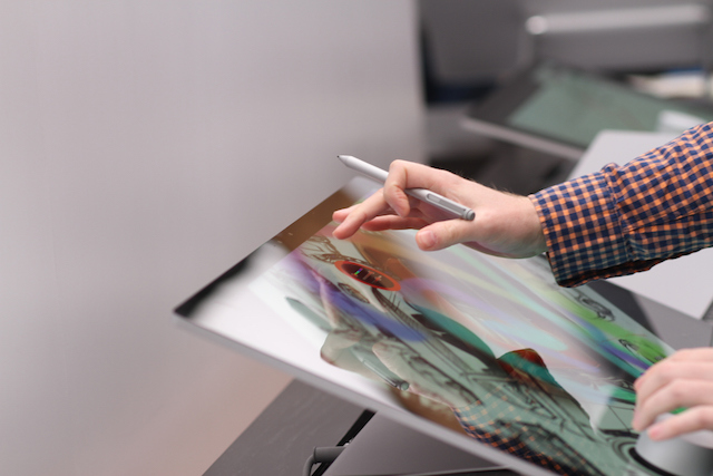
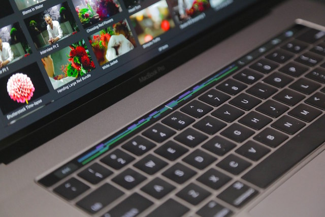
Sunday Snapshot 10/30/16 Creating creative computers: This past week saw the introduction of two new computers with core features designed with creative professionals in mind. Microsoft revealed its surprising Surface Studio all-in-one desktop PC, and Apple made the first significant hardware design change to the MacBook Pro since around 2012. The Surface Studio was unveiled on Wednesday, and Apple's new MacBook Pros were debuted Thursday. The Surface Studio featured a 28-inch, fully touch-enabled display. The MacBook Pro also used touch in a starring role, as the interaction method for its new Touch Bar, a thin OLED screen that replaces the function row of keys and changes its available uses based on what software you're using. 
It was probably the most explicit acknowledgement yet that traditional personal computers are now specialist devices, made for a small group of users who can't do everything they need to do in terms of computing on a mobile device or a tablet. And it was a look at what both Apple and Microsoft believe are the priorities of that group in terms of being able to get that specialist work done. Microsoft's Surface Studio looks like a graphics professional's dream – that 28-inch display can actually display multiple color gamuts so you can check what the final product will look like on various end-user computers, and the articulating angle lets you use it at a perfect drafting table incline with Surface Pen and Surface Dial. It's not portable, and it's $3K, but the same is also true of Wacom's top-end Cintiq 27QHD drawing tablet – and that's just a display, not an actual PC. Meanwhile, Apple's MacBook Pro with Touch Bar is the thinnest, lightest and smaller MacBook Pro ver made, yet it also has what looks like Apple's best display, including support for the P3 color gamut. And while it doesn't have touch or pen input on the display itself, that Touch Bar will offer a lot of flexibility for things like advanced photo and video editing workflows, including allowing fullscreen editing with an even more unobstructed view of what you're working on. 
Both of these computers have clear trade-offs and limitations you can see out of the gate: Apple has done away with all ports except for four Thunderbolt 3, which use the USB-C physical port design and which can provide power (both ways), drive up to four 4K displays simultaneously and transfer data with blazing speed. But that means adapters and new cables, and the lack of conveniences like being able to plug SD cards from a camera directly into your computer, for instance. The Surface Studio's starting price is its main barrier to entry: At $3,000 for just the base model, it's likely only going to appeal to a very specialist crowd – and one that would not prefer a PC with a more powerful graphics card capable of VR or very heavy video editing workflow instead of a screen with direct input. Ironically, even as the need for computers among average users is increasingly satisfied by mobile devices, the diverse needs of the remaining pros aren't any easier to address with one single design. In fact, they might be more fractured than ever, as evidenced by the very different approaches taken by Apple and Microsoft with both their all-in-ones and their notebooks. Both the new MacBook Pro and the Surface Studio are compelling, opinionated takes on what the future holds for desktop and notebook computers, and the mixed response to each on social media reflects the boldness of these choices. But they both signal that whatever comes next for the increasingly niche category of PCs, it's an exciting time to be in the class of user that still needs and uses these devices. Get the context: |
No comments:
Post a Comment